
Case study · Slovakia · December 2019 to February 2020

The election calculator one in ten Slovaks completed.

A side project by two people on evenings and weekends: answer 34 opinion statements, get your closest political parties in three minutes, share the result. No marketing budget. Within a month of launch more than half a million people had finished it, and the national press wanted to know who was behind it.

522,254completed calculators in under one month
3 minaverage time to a result
98,774people asked for a detailed analysis by email
CHF 0spent on marketing
My roleIdea and concept, user research, UX and UI design, front-end development
WithMarián Vismek, back-end development
MethodsInterviews, survey (n = 150), persona, empathy map, scenario, user flow, information architecture, paper and digital wireframes
StatusTaken offline after the 2020 election. Figures are from the site's analytics at the time and were quoted by the press.
Rebuilt in 2026 from the original 2020 case study. Screenshots show the Slovak product; the captions explain them.
00Why

Interest in the parliamentary election was at a historic low.

The 2020 parliamentary election mattered more than any other vote in Slovakia, and turnout had been falling. I follow politics daily and had been designing products for four years. The calculator was the obvious place to connect the two: make "who should I vote for?" an easier question, and get people to care.

Discover

Goals, constraints and the people it is for.

Define

Interviews, a survey of 150 people, a persona and an empathy map.

Ideate

A scenario, the user flow and the information architecture.

Design & test

Paper prototypes, then low- and high-fidelity wireframes.

01Discover

Design strategy

A checklist of what the project had to achieve, what could get in the way, and what "good" would look like.

1 · Business goals

Build credibility around an election calculator, collect the opinion preferences of thousands of people to evaluate views in society, and collect email addresses for follow-up projects.

2 · Target users

Students, working professionals, singles and married people. In practice, anyone entitled to vote who had not yet decided.

3 · Core task

Find the political party that shares the user's opinions and values.

4 · Technology constraint

Built for current browsers on mobile first, since most traffic was expected from social media on phones.

5 · Marketing

Content that is easy to share for each user, plus social-media posts and press coverage. No paid channels.

6 · Success factor

A relevant result for every user, one that represents reality well enough that people trust it and pass it on.

02Define

What is the problem, exactly?

Short interviews first, then a survey of 150 people to check whether what I heard was typical.

2.1Interview questions

  • How old are you?
  • Have you decided which political party you will vote for?
  • Do you know the programmes of the political parties?
  • Where do you get your news?

2.2Survey of 150 people

How old are you?

  • 18–2533 % (49)
  • 26–3530 % (45)
  • 36–5528 % (42)
  • 56+9 % (14)
150 participants

Have you decided whom to vote for?

  • Decided67 % (100)
  • Undecided33 % (50)
150 participants

Do you know the parties' programmes?

  • I know them13 % (20)
  • I don't87 % (130)
150 participants

Where do you get your news?

TV news30 % (45)
Online news24 % (36)
Facebook19 % (29)
Newspapers16 % (24)
Instagram6 % (9)
Other5 % (7)
150 participants

2.3What the research said

One number decided the direction: 87 % of respondents did not know the parties' programmes, and a third had not decided whom to vote for. The interviews explained why.

  • People find it hard to locate relevant information about a party online.
  • People want to know, in a few easy steps, which party best represents their values.
  • People want that information online, not in a printed programme.
  • People are overwhelmed by claims about which party is "the best".

2.4Persona

Built from the survey to keep the design honest about who it was for.

Persona photo: a young man in a white T-shirt, smiling
Paul, 26I have no idea what the political parties have on their agenda.
Gender
Male
Income
Under 15k a year
Occupation
Car manufacturing
Status
Engaged
Location
Levice, Slovakia

About

Paul works in car manufacturing. After work he is exhausted and has no desire to analyse party agendas. His decision is mostly shaped by close friends and what he finds on Facebook. He would like to know which party he is actually closest to.

Pain points

  • Relevant information is complicated to find
  • Too many political parties
  • Does not know which party he matches best

Motivation

  • Find his match
  • Talk about parties with friends on social media
  • Votes regularly

Needs

  • An easy way to find his match in a short time
  • Share the result with friends
  • See his top three parties

Social media

FacebookInstagramTwitter

Right now

Stressed, busy, confused. Adventurous, into tech.

2.5Empathy map

What Paul says, thinks, does and feels, and the pains and gains that follow. It also shows where the research still had holes.

Says

  • "I want to know how much I agree with the parties, by values and opinions."
  • "I want a reliable source of information."
  • "I don't know where to start looking."

Thinks

  • "There are too many parties and I don't know where to begin."
  • "Do I need a degree in political science to find the party that suits me?"

Does

  • Talks with friends about their choices.
  • Occasionally reads online news about a party.

Feels

  • Impatient: there is a ton of information.
  • Confused: too many contradictory opinions.
  • Worried: not sure which decision is right.

Pains

  • Hard to decide which party is best.
  • Hard to know a party's agenda.

Gains

  • An easy way to find a match quickly.
  • A result with a percentage match per party.
  • Something to share and discuss.
03Ideate

From the need to the fulfilment of the need.

A scenario to keep the motivation in view, a user flow to keep the steps few, and an information architecture to keep the site small.

3.1Scenario

Deciding whom to vote for in the 2020 parliamentary election

Friday night. Paul comes home after another exhausting week. The election is close and he still does not know which party to vote for. He has no energy to flip through hundreds of pages of party programmes. He types "election calculator" into his phone.

He finds volbydoparlamentu.sk. He answers a series of statements, agree or disagree. He is surprised to have a result in three minutes.

Now he can see how well he matches the party leading in the polls. He is relieved to have finally decided, and shares the result on Facebook to show his friends what he stands for.
3.2User flow

Every step a user takes to complete the one task the site exists for. The dashed exit is the only way to fail: leaving before starting.

User flow: landing page, about the project or select age and sex, start the calculator, answer all statements, mark the important ones, calculate, result page, share on Facebook or show all results, task end you Landingpage About the project Select age & sex Start the calculator Start failed Answer all statements Mark the important ones Calculate the result Resultpage Share on Facebook Show all results Task end
  1. Landing page
  2. About the project, or select age and sex
  3. Start the calculator (leaving here is the only way to fail)
  4. Answer all statements
  5. Mark the important ones
  6. Calculate the result
  7. Result page
  8. Share on Facebook, or show all results
  9. Task end

3.3Information architecture

Three pages. Everything else would have cost time and lost people.

Landing page
About the project
The calculator
Result page
Result information
Share on Facebook
Show all results
Email with more information
Deeper analysis
04Design
& testing

Paper first, pixels last.

Each of the three pages went through the same three passes: a paper sketch to test the idea, a grey wireframe to test the structure, and a high-fidelity wireframe with real content to test the tone.

4.1Paper prototypes

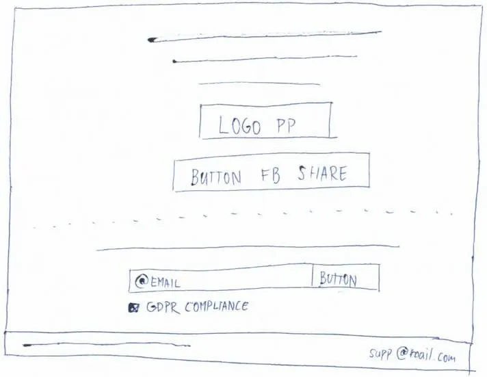
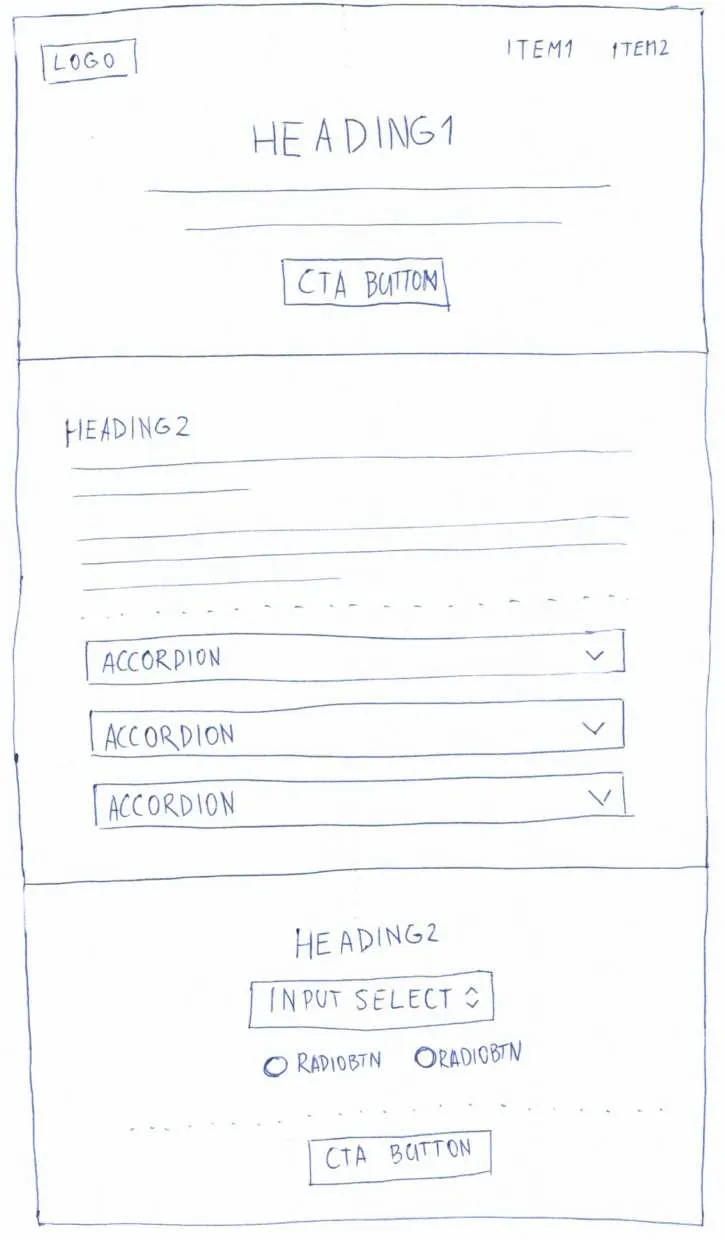
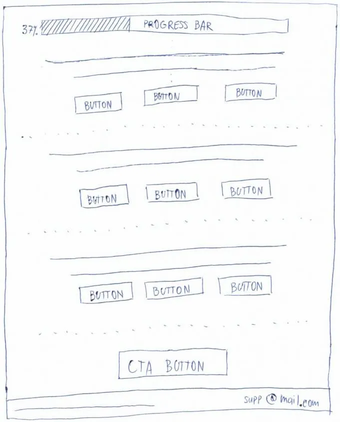
Paper is the cheapest way to find out that a layout does not work. The landing page needed the calculator's entry form, an explanation and the age and sex selector on one scroll.

Paper sketch of the landing page, upper half: logo, heading, call to action, accordionPaper sketch of the landing page, lower half: progress bar and rows of answer buttons
Landing page
Paper sketch of the result page: party logo, share button, email field with consent checkbox
Result page
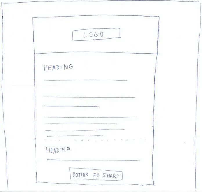
Paper sketch of the email with more information
Email with more information

4.2Low-fidelity wireframes

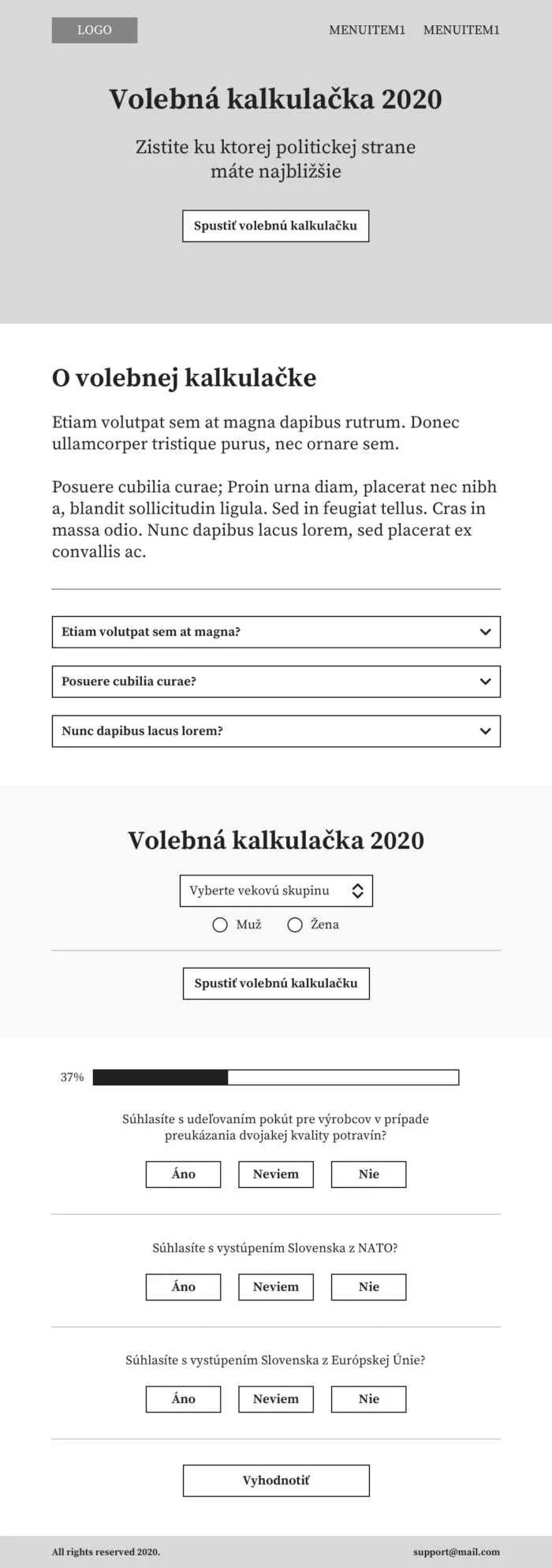
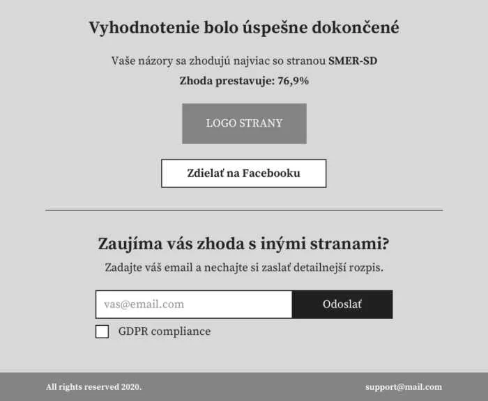
Grey boxes with the real Slovak copy in place. This is where the statement cards got their three-button rhythm and the result page got its email step.

Low-fidelity wireframe of the landing page in Slovak
Landing page
Low-fidelity wireframe of the result page: match percentage, share button, email form
Result page
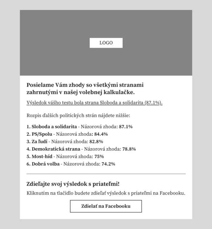
Low-fidelity wireframe of the email with the full ranking of parties
Email with more information

4.3High-fidelity wireframes

Real logo, real content, the final colours. The hero photo of the parliament building set the tone: serious, but not a government site.

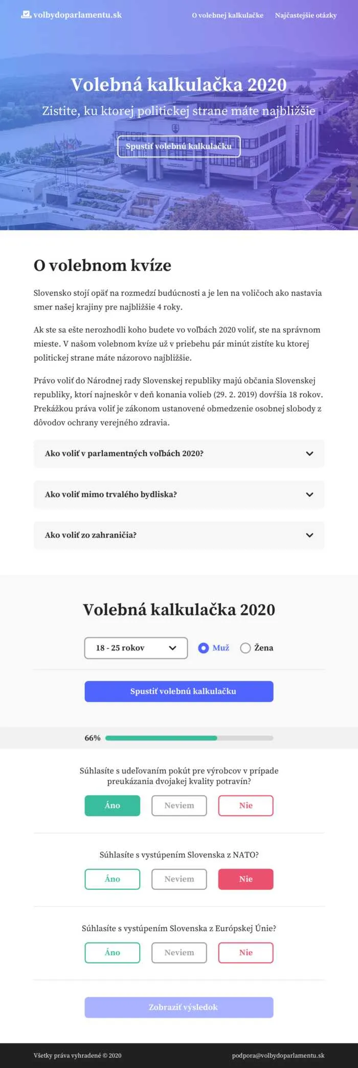
High-fidelity wireframe of the landing page: photo of parliament, title 'Volebná kalkulačka 2020', statement cards
Landing page
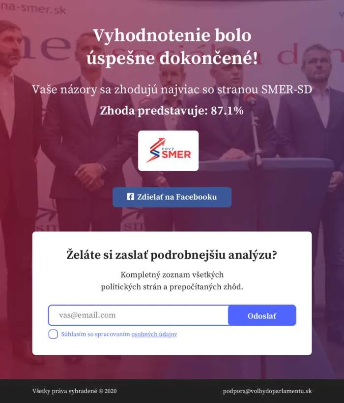
High-fidelity wireframe of the result page with the match percentage and the email form
Result page
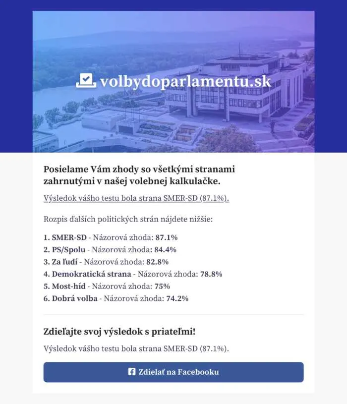
High-fidelity wireframe of the email listing the match with every party
Email with more information
05What
happened

How it worked.

Two IT enthusiasts, several evenings and weekends. I created the idea and the concept and owned the user experience; my colleague Marián Vismek built the back end. The result surprised us both.

In under one month

522,254

More than half a million people completed the calculator, roughly one in ten Slovaks.

3 min

Average time from the first statement to the result.

98,774

People who asked for a detailed analysis by email.

Organic channels only

Nothing was paid for. The channels that carried the site simply liked the idea.

94

External backlinks pointing to the site, from 16 referring IPs.

16,900

Interactions on the site's posts, including 2.5k shares and 7.5k comments.

9+

Influencers who supported the idea without being asked or paid.

In the press

Four articles in national media. Headlines are translated; each card links to the Slovak original and to an automatic translation.

Portrait of Daniel Kušnirik used by aktuality.sk
aktuality.sk · February 2020Elections 2020: we know who is behind the viral pre-election quiz. He wants to promote the election, not misuse data.Voľby 2020: Vieme, kto stojí za virálnym predvolebným kvízom. Chce propagovať voľby, nie zneužívať údaje Original · Auto-translated
Daniel Kušnirik and Marián Vismek photographed for startitup.sk
startitup.sk · February 2020The election calculator gives an exclusive look at the opinions of more than half a million Slovaks.Volebná kalkulačka prináša exkluzívny pohľad na názorové preferencie viac ako pol milióna Slovákov Original · Auto-translated
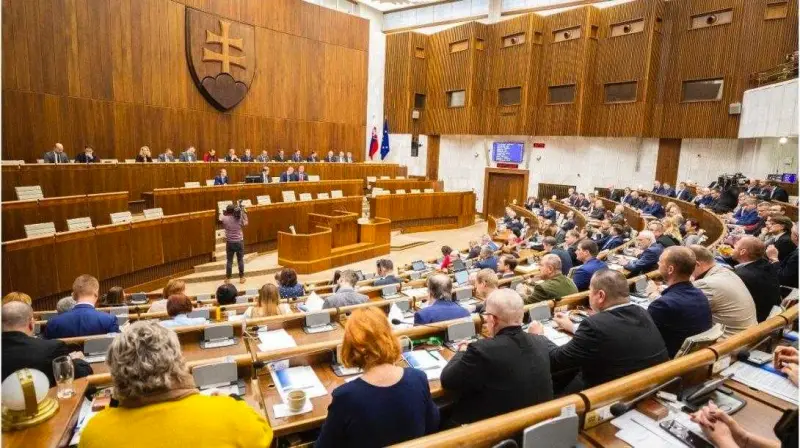
The Slovak parliament chamber in session
startitup.sk · February 2020This site tells you in a few minutes whom you should vote for.Vďaka tejto stránke zistíš v priebehu pár minút, koho by si mal voliť Original · Auto-translated
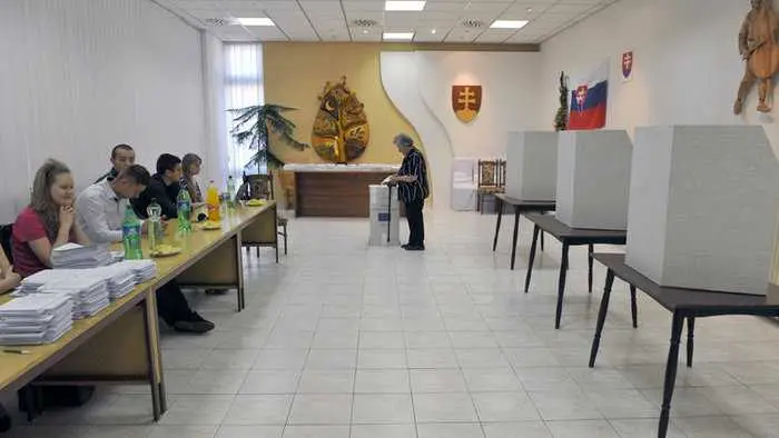
A polling station in Slovakia
tvnoviny.sk · February 2020An election quiz can help undecided voters.Nerozhodnutým voličom môže pomôcť volebný kvíz Original · Auto-translated

On Facebook

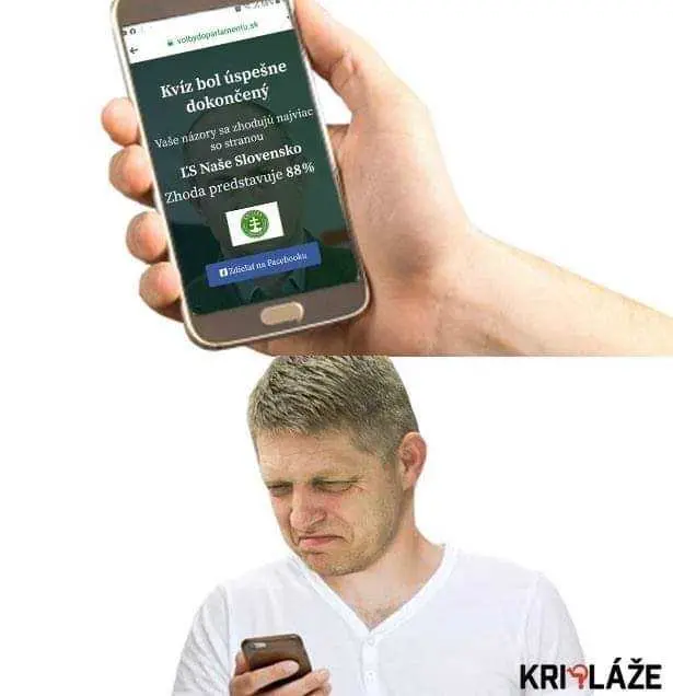
The biggest satire pages in the country posted their own results. That, more than the press, is what made it viral.

Image from a Facebook post reacting to the calculator: a child grimacing Meme by the page Kripláže: a man looking at his phone in disbelief next to a screenshot of his result The calculator's share image: the parliament chamber tinted blue with the site name volbydoparlamentu.sk

On Instagram

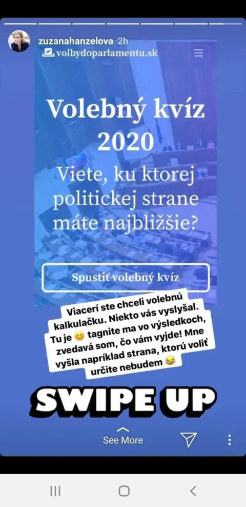
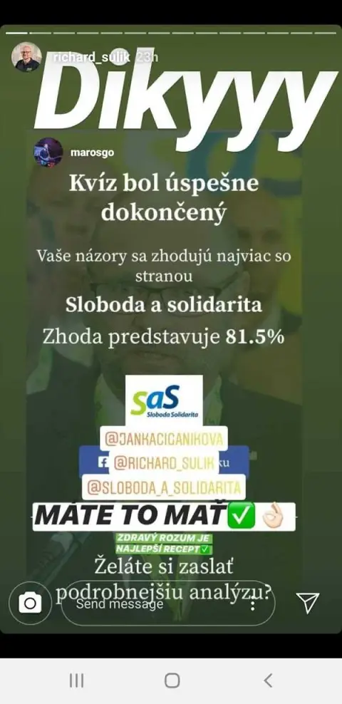
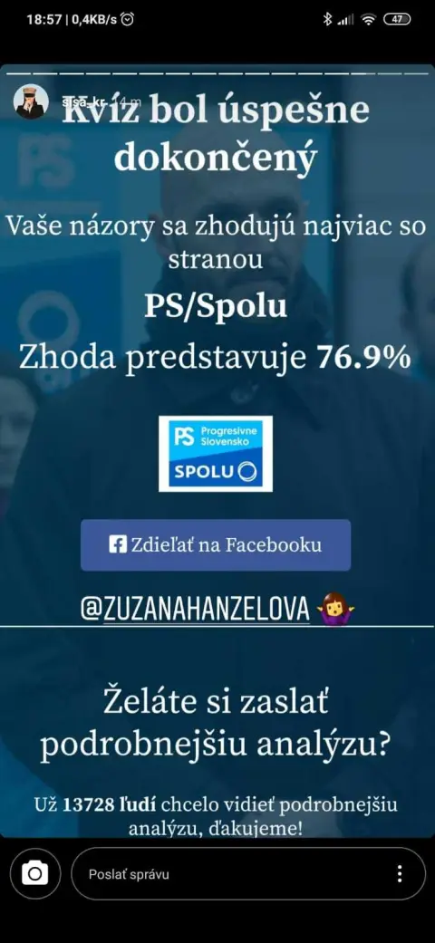
Politicians and public figures posted their results as stories with a swipe-up link. None of it was arranged.

@richard_sulik25.8k followers · party leader
@kristina.tormova118k followers
@zuzanahanzelova60.8k followers · journalist
@sisa_kr60k followers
Instagram story: 'Volebný kvíz 2020', swipe up Instagram story with a completed quiz and the caption 'Dikyyy' Instagram story: 'quiz completed successfully', with a match percentage Instagram story: a selfie recommending the quiz

A few last words

At the start I did not know whether the project was worth even an hour. By the end it clearly was. Turnout in the 2020 election rose from 59.8 % to 65.8 %, the highest since 2002. The calculator cannot claim that, but it was part of a month in which a lot of people talked about voting.

What I would keep today: research before pixels, three pages instead of ten, a result people want to share. What I would add: a clearer data notice up front, because the first question the press asked was about the emails.